
 by Amit Goel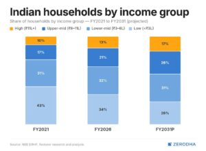
This chart tracks the share of Indian households across four income brackets from FY2021 through FY2031, and at first glance the trend looks unambiguously positive. The High-income group (₹11L+) grows from 10% to a projected 17%, Upper-mid rises from 17% to 26%, while the Low-income group (under ₹3L) shrinks from 43% to just 26% over the decade. On paper, this reads as a textbook growth story — a nation climbing the income ladder.
A household appearing in a higher tier on this chart may simply be earning a higher nominal number while its actual purchasing power stays flat or falls, once inflation, EMIs, and rising cost-of-living are accounted for. Real wage growth in India has remained largely stagnant through much of this period, and when nominal income rises only enough to keep pace with — or lag — inflation, the household has not gained ground; it has simply been repriced. None of these brackets are adjusted for inflation, which means the entire pyramid is being read in rupee terms from different points in time as if they carried equal value. What looks like upward mobility on this chart may in many cases be inflation-driven repricing rather than genuine income growth. The share of disposable income after essential expenses has been under continuous pressure, meaning the same household counted as “moving up” here could have less leftovers at the end of the month than it did in FY2021.
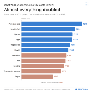
Read against the previous chart, the real story becomes clear: households climbing income brackets over this period were not necessarily gaining purchasing power — they were running to keep up. A household’s income moving from ₹3L to ₹6L looks like doubling on the income chart, but the cost of living rose at nearly the same pace, and the two have not matched. Inflation has been quietly eating into income gains year after year, so by time earnings rose enough to cross a bracket, a large share of that gain was already consumed by higher prices on the same basket bought a decade ago. This pressure hasn’t eased in the near term either — prices continue outpacing wages on essentials, widening the gap rather than closing it. For households in the lower brackets, where nearly the entire income goes toward personal care, food, health, and housing, there was little or nothing left over. The pyramid did not rise. It was offset by the loss of purchasing power.
Conclusion
Together, these charts challenge the idea that India’s income story has been one of genuine prosperity. What looks like progress in isolation cancels almost entirely when the cost of living rises at nearly the same pace as reported income — especially for lower and lower-mid households, where spending is concentrated in exactly the categories that inflated the most. The picture worsens further when weighed against employment quality — a bracket built on informal or unstable jobs can reverse as fast as it climbed, and for households already close to the margin, this pressure doesn’t just slow progress, it erodes what little buffer they had. This matters beyond household budgets: sectors that price their growth assumptions off headline income data risk overestimating real demand, since a household earning more today may have no more actual spending power than one earning less years earlier. The real test isn’t whether income rose in nominal terms — it’s whether what’s left after essentials has grown, and on that measure, the picture is far less certain than the numbers suggest.