
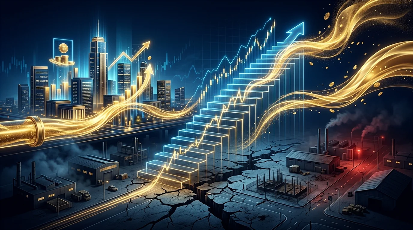
AI Infrastructure Spending Is Entering a New Growth Phase?
This chart highlights that the ongoing AI-driven data center buildout is evolving into one of the largest capital projects in modern history. In just six…
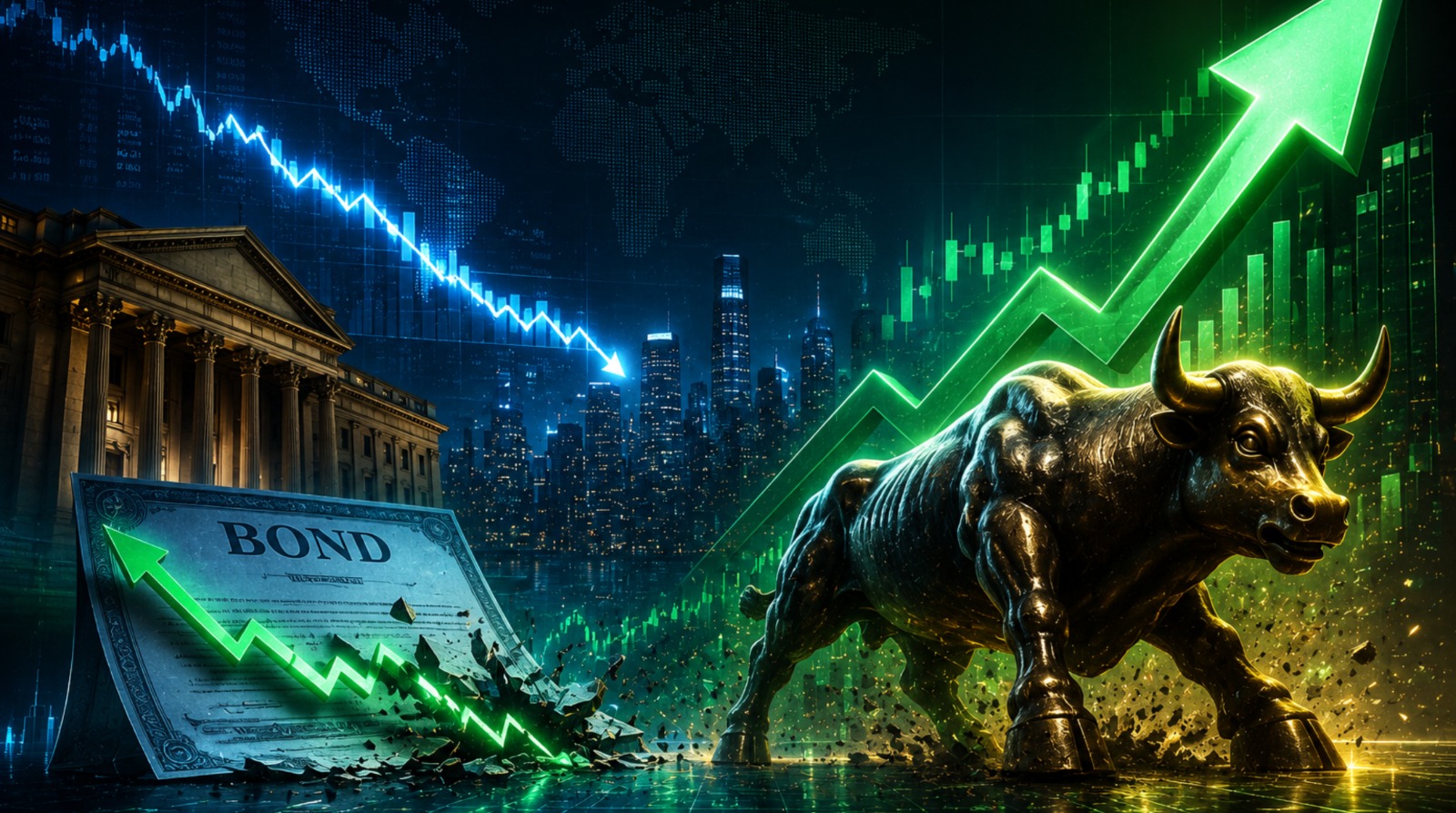
If Bond Yields Fall, The Next Leg of the Bull Market May Begin
This chart shows that global long-term bond yields have risen to their highest level since the 2008 financial crisis, marking a significant normalization of financial…
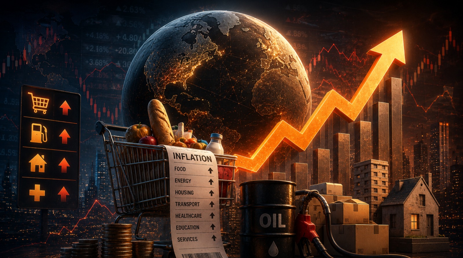
Persistent Inflation Is Becoming a Structural Global Risk
This chart shows that inflation is once again rising faster than wage growth, creating renewed pressure on consumers and weakening real purchasing power. The recent…

Extreme Dependence on AI Is Reshaping the Economy
This chart highlights how strongly the current S&P 500 earnings growth is being driven by artificial intelligence spending. In 2026, nearly 42% of total EPS…

The Great Supply Shock: Oil Markets Enter a Fragile Phase
This chart shows that global oil inventories are falling rapidly and could soon approach critically low operational levels if current supply disruptions continue. The…

From Gulf to Global: The Hidden Link Driving Food Inflation
This chart highlights a strong relationship between oil prices and global food inflation—when crude oil rises...

The Great Imbalance: Rising Debt, Slowing Economic Momentum
The chart highlights a critical shift in the global macro landscape: while absolute global debt has continued to climb relentlessly
When Liquidity Expands but Growth Contracts
This chart highlights that global liquidity has reached an extremely elevated level, with total broad money

This Reset Is Building the Next Bull Run
The chart indicates that the forward valuation of the S&P 500 has declined and is now hovering around...

Market Corrections Create Opportunity, Not Fear
The chart shows that the valuation premium of MSCI India Index over both the MSCI All Country World Index

Oil Shock. Equity Fear. Buying Opportunity
Sharp oil spikes have historically created an immediate risk-off reaction in equities, but they have not usually marked the start

Markets Absorb Crises — And Still Climb to New Highs.
The long-term trajectory of the S&P 500 reveals a powerful structural pattern: despite repeated geopolitical disruptions