
From Gulf to Global: The Hidden Link Driving Food Inflation
This chart highlights a strong relationship between oil prices and global food inflation—when crude oil rises...
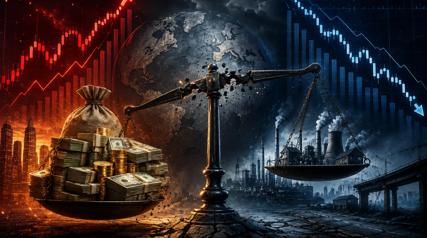
The Great Imbalance: Rising Debt, Slowing Economic Momentum
The chart highlights a critical shift in the global macro landscape: while absolute global debt has continued to climb relentlessly
When Liquidity Expands but Growth Contracts
This chart highlights that global liquidity has reached an extremely elevated level, with total broad money

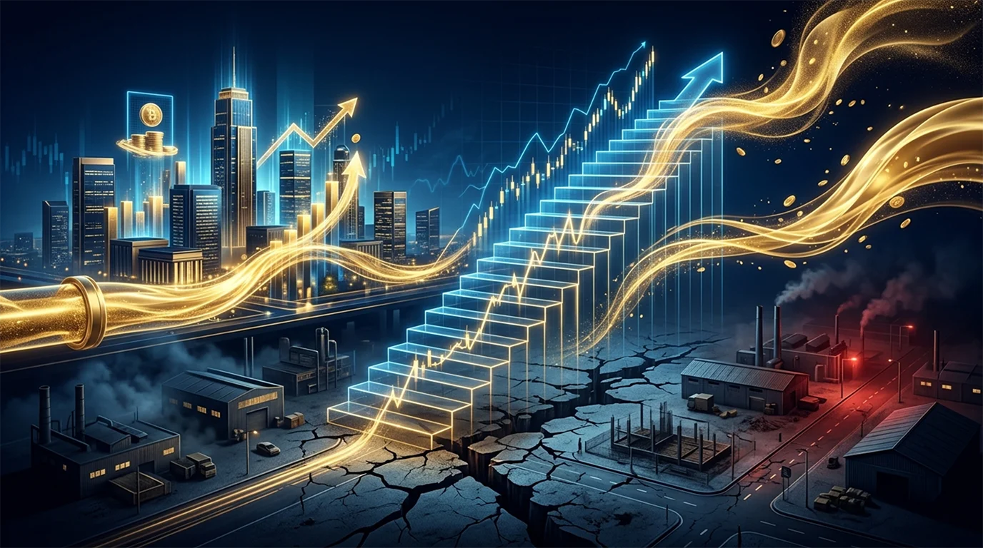
This Reset Is Building the Next Bull Run
The chart indicates that the forward valuation of the S&P 500 has declined and is now hovering around...

Market Corrections Create Opportunity, Not Fear
The chart shows that the valuation premium of MSCI India Index over both the MSCI All Country World Index

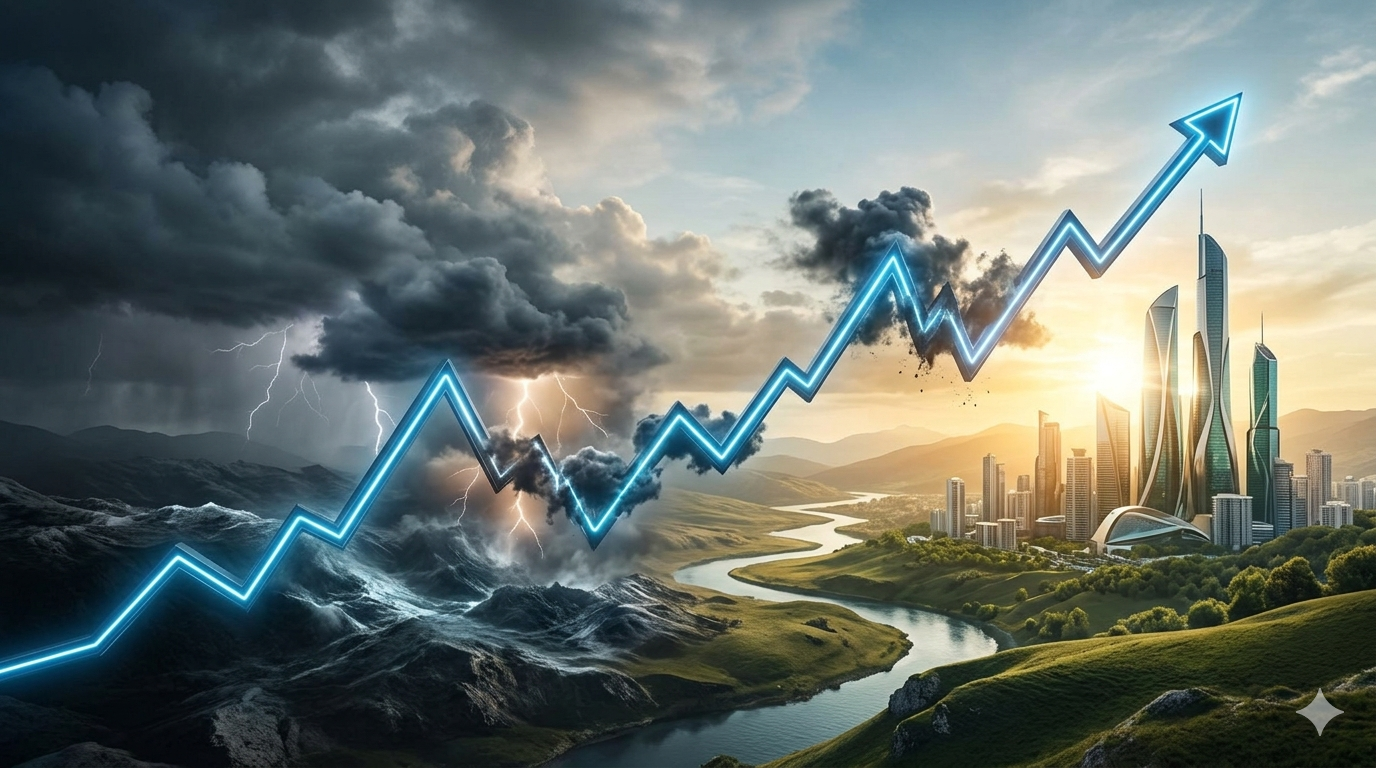
Oil Shock. Equity Fear. Buying Opportunity
Sharp oil spikes have historically created an immediate risk-off reaction in equities, but they have not usually marked the start
Markets Absorb Crises — And Still Climb to New Highs.
The long-term trajectory of the S&P 500 reveals a powerful structural pattern: despite repeated geopolitical disruptions

The Center of Global Influence
This chart illustrates how G7 economies have emerged from the pandemic with output levels firmly above their pre-COVID...
AI Euphoria Meets Reality: Capex Is Surging Faster Than Profits
The chart shows that Big Tech companies are continuing to aggressively increase AI-related capital expenditure (Capex)

Electricity: The New Economic Engine
The chart shows a structural shift in global power generation, with solar and wind rapidly scaling and set to overtake...
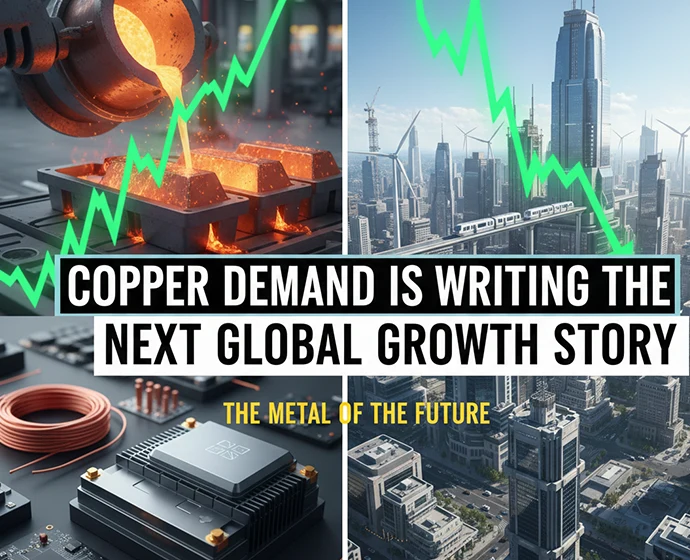
Copper Demand Is Writing the Next Global Growth Story
Copper’s breakout to record highs is increasingly reflecting a structural repricing rather than a cyclical spike, with the...
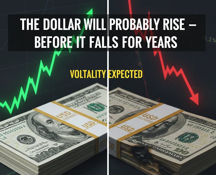
The Dollar Will probably Rise — Before It Falls for Years
The chart shows the Bloomberg Dollar Spot Index falling ~8% in 2025, its worst annual decline in eight years, marking a clear...